UX Case Study
BigPay App
( E-Wallet )
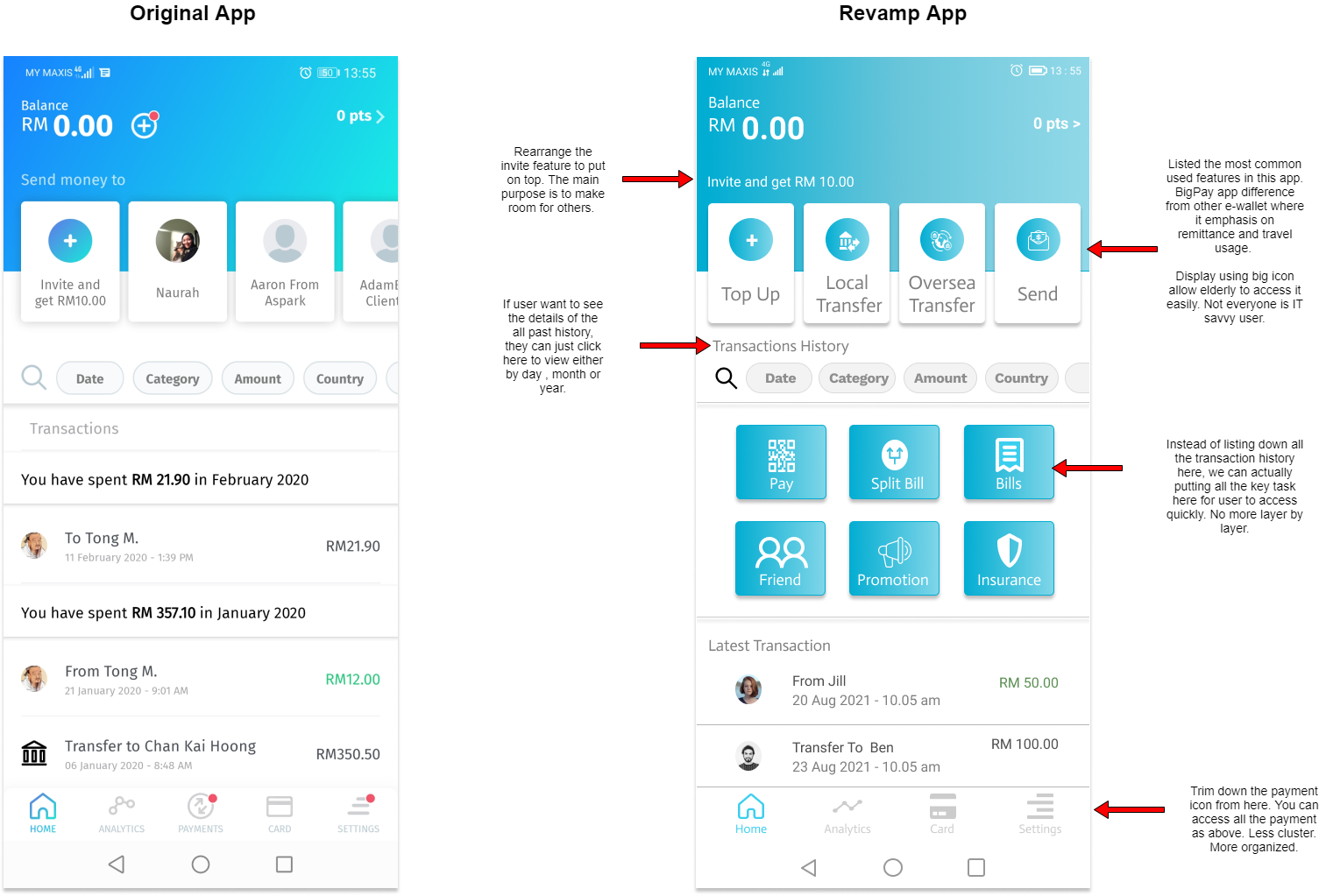
I did a teardown on existing BigPay App. There are a few things that can be improve in this app. With my revamp, the steps taken to achieve the same task can be much faster than before. Overall the screen also looks less clutter.
Challange
Discover the pain points of the current app and propose a solution to improve the user experience.
My Role As Product Designer
User Research , Persona , User Flow , Sketches , UI , Prototype , Usability Testing
Process Flow
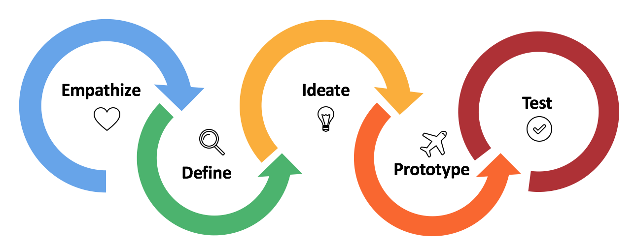
I have conducted an early usability testing on the existing app and compare with my redesign app with a few selected testers. After collecting all the feedbacks and suggestions, I try to synthesize the data and came out with an affinity map. The reason is to identify the exact pain points and list down priorities. Compare with existing user flow, I've sketched a new revised layout and cross checked with users before proceed to high fidelity wireframe. Final design only rolls out once validation has been confirmed. The whole process takes about 2 weeks.
Design Thinking Methodology
User Research
Since this is a personal case studies, I've done a mock up and did some changes to the UI. From there, I've chose five existing BigPay's user to review and comment. The main objective of this research is to improve the user experience of BigPay app and make a bigger impact to the user experience. A quick early usability testing has been conducted to gain feedbacks and suggestions.
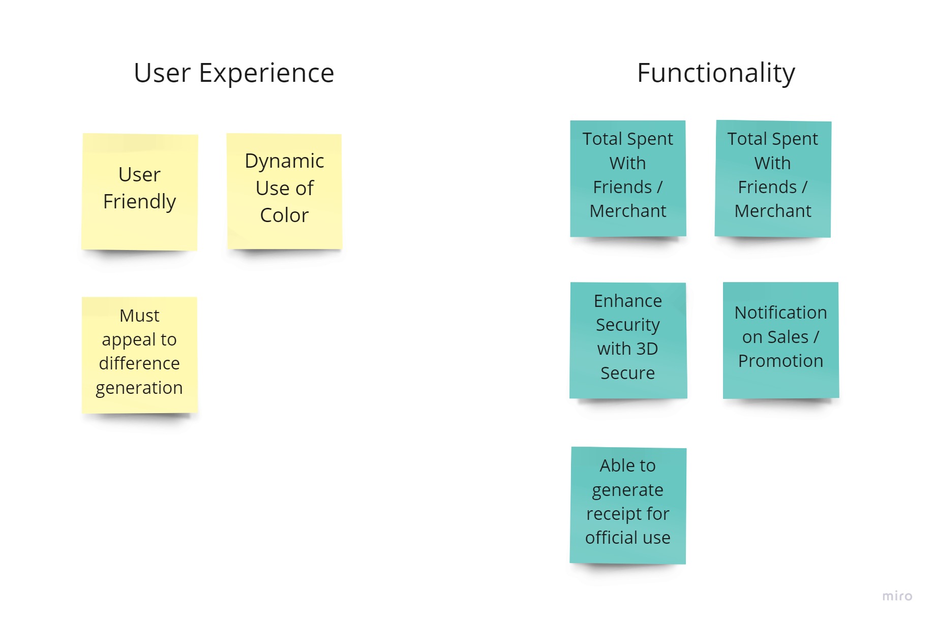
Affinity Map
I've synthesized my findings based on priorities and functionality required by user. The research data are organized according to different zone in affinity map. From these arrangement, I've list down what are the priorities and important features that user value.
Persona
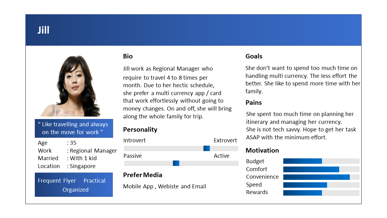
To help better understand user feel towards the app, I've created persona based on the data collected for us review.
Ideate
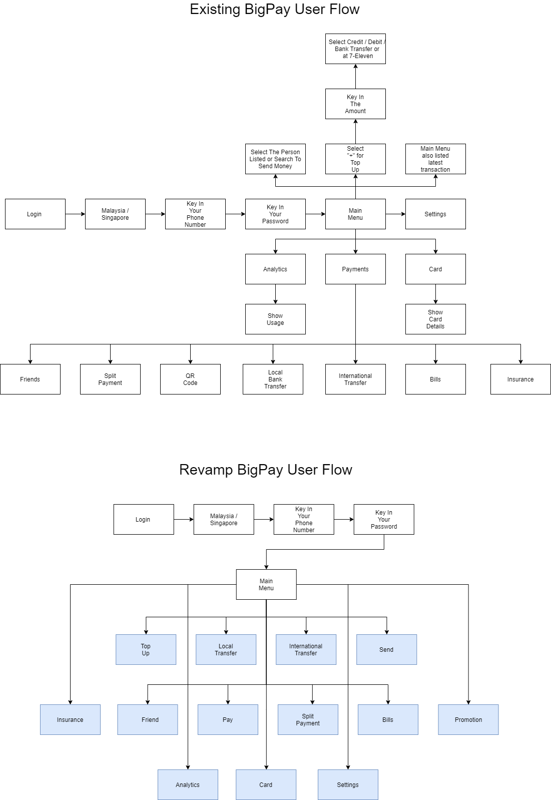
Based on the sketches , brainstorming session and persona created above, I have come out the new revamp user flow where it will greatly enhance the user experience by cutting down the steps need to achieve each task and some improvement on UI where we can execute our task more efficiently.
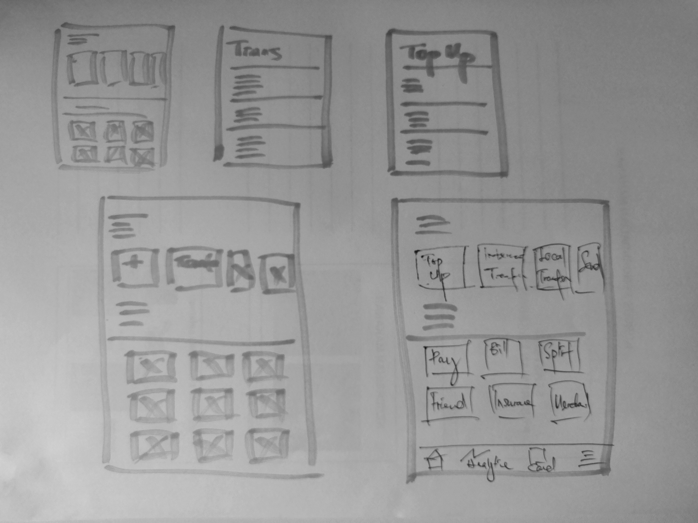
Sketches
By sketching out the layout I want, I can use it to ideate how the revamp prototype going to look like. These sketches help me to map out how the new user flow will be.
Wireframe
I've made some enhancement to the existing app. The wireframe shown below emphasis on user friendliness approach and also make sure elderly can use it effortlessly. Cutting down the digital divide and make more impact on this app.
Prototyping
The aim of this video is to show the prototype in action. It highlight what has been changed and improved to gain better user experience.
Impact
80% of the reviews and comments from the survey have been favor of the makeover.